A resource for participatory design to create social, economic, political, and ecological change for the common good.
A New Synthesis
The past century has been marked by division. We need a new synthesis.
In the service of industrial models of social and political engineering, art and technology have been co-opted to participate in a military-industrial complex that is a synthesis of our worst human characteristics: greed and hatred.
We are caught in a dialectic of opposing forces, in the politics of thesis and antithesis, right versus left. We need a new synthesis that transcends the old paradigms. Unity in diversity is the model for both the organism and the planet.
The new synthesis is integrating biology and physics. The future of design and architecture may be in the integration of the separate disciplines to learn how interconnected systems work and model the built environment to imitate the processes of living organisms. We are beginning to see these changes happening through the self-organizing principles of biological adaptation.
Project Description
The intention for the Design Influences site has always been to build a community to think about how design influences culture. Thousands of years of human history have influenced the technologies that we use to communicate and to shape our environment.
The vision for the site structure builds off the three elementary forms derived from the pedagogical approach of the Bauhaus.
If the physical is a metaphor for the metaphysical, the three elementary forms and three primary colours signify the design process.
- Imagine
- Design
- Build
For each step in the process, there are ways of thinking about design that goes beyond physical artifacts and integrates the way we understand and imitate living systems.
Imagine
- Resources
- Theory
- Research
- Strategy
Design
- Ethics
- Principles
- Process
- Systems
Build
- People
- Relationships
- Community
- Social Architecture
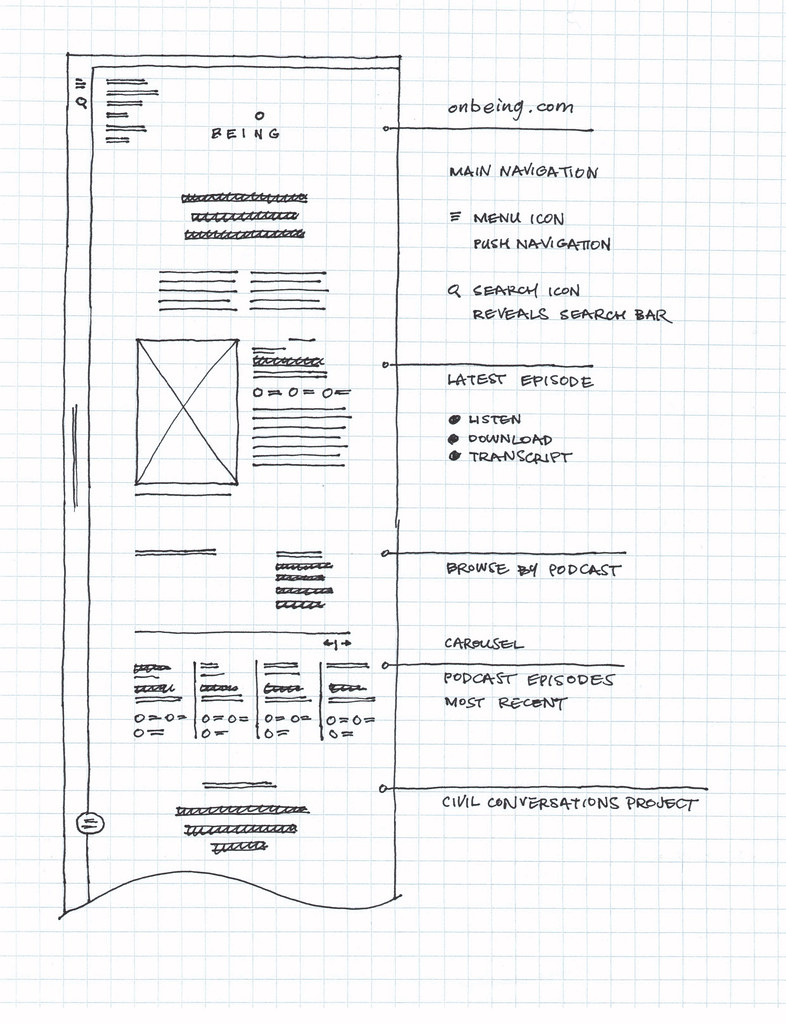
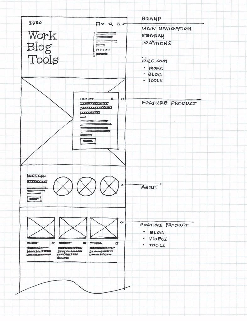
Wireframe Sketches
A popular approach to creating website layouts was developed around the time that designers were responding to the widespread adoption of web standards and the increasing desktop screen sizes.
Nathan Smith created the 960 Grid System, which was adopted as a standard approach to simplifying the process of creating fixed-width site designs. At the time, I was exploring the possibilities of fluid-width grid systems and published the Fluid 960 Grid System, as noted by Smashing Magazine.
The same modular approach to building sites still applies to responsive web design.
These sketches demonstrate an approach to using grid paper by making use of a 12-column grid system, plus one column on the left and another on the right of the grid to account for the page margins.
With these 14-columns, it is possible to analyze the layouts of the sites that are the inspiration for the design of a resource for participatory design.
Namika Hamasaki


GatesNotes

Medium

IDEO
On Being